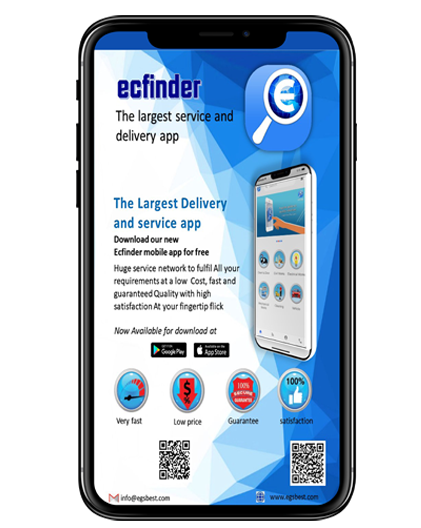
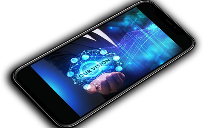
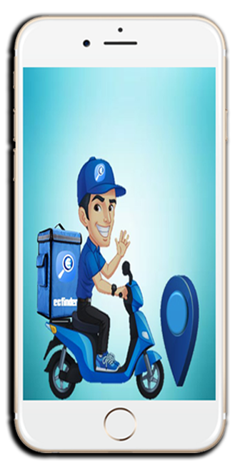
Bring the seamless connectivity among consumers with the service & business providers to minimize the effort taking by consumers to get any kind of product or services in the fast moving generation.
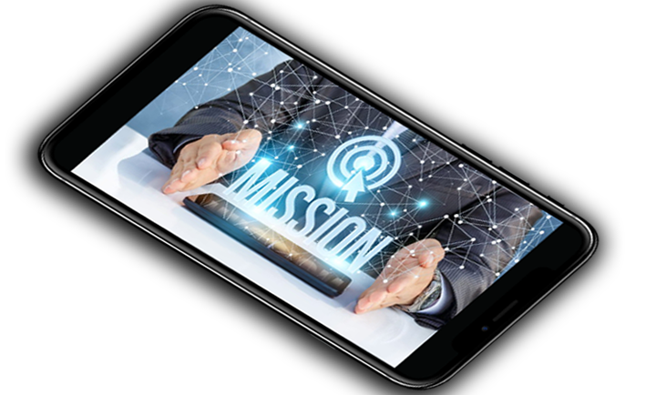
We bring the service & business providers to the fingertips of consumers through our web and mobile apps,we achieve consumer satisfaction through the exellent service to our visitors from nearby service providers.
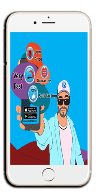
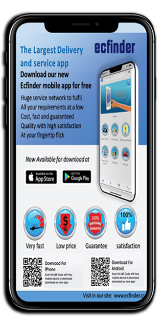
♦ Available on both Play Store & AppStore.
♦ Users can easily order or book a service just in a single click.
♦ Light weight Application consume less memory.
APP STORE PLAY STORE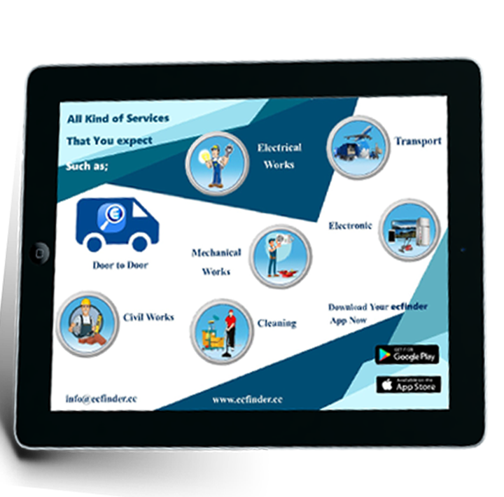
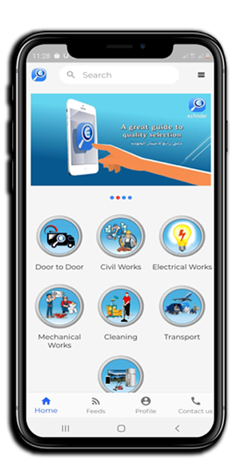
♦ Provide your services to the suitable customers for best price range.
♦ Getting live notification around 10kms of registered service request.
APP STORE PLAY STORE
Copyright © 2020/2021 Whitech Technologies - All rights reserved